Helping recruiters price with confidence
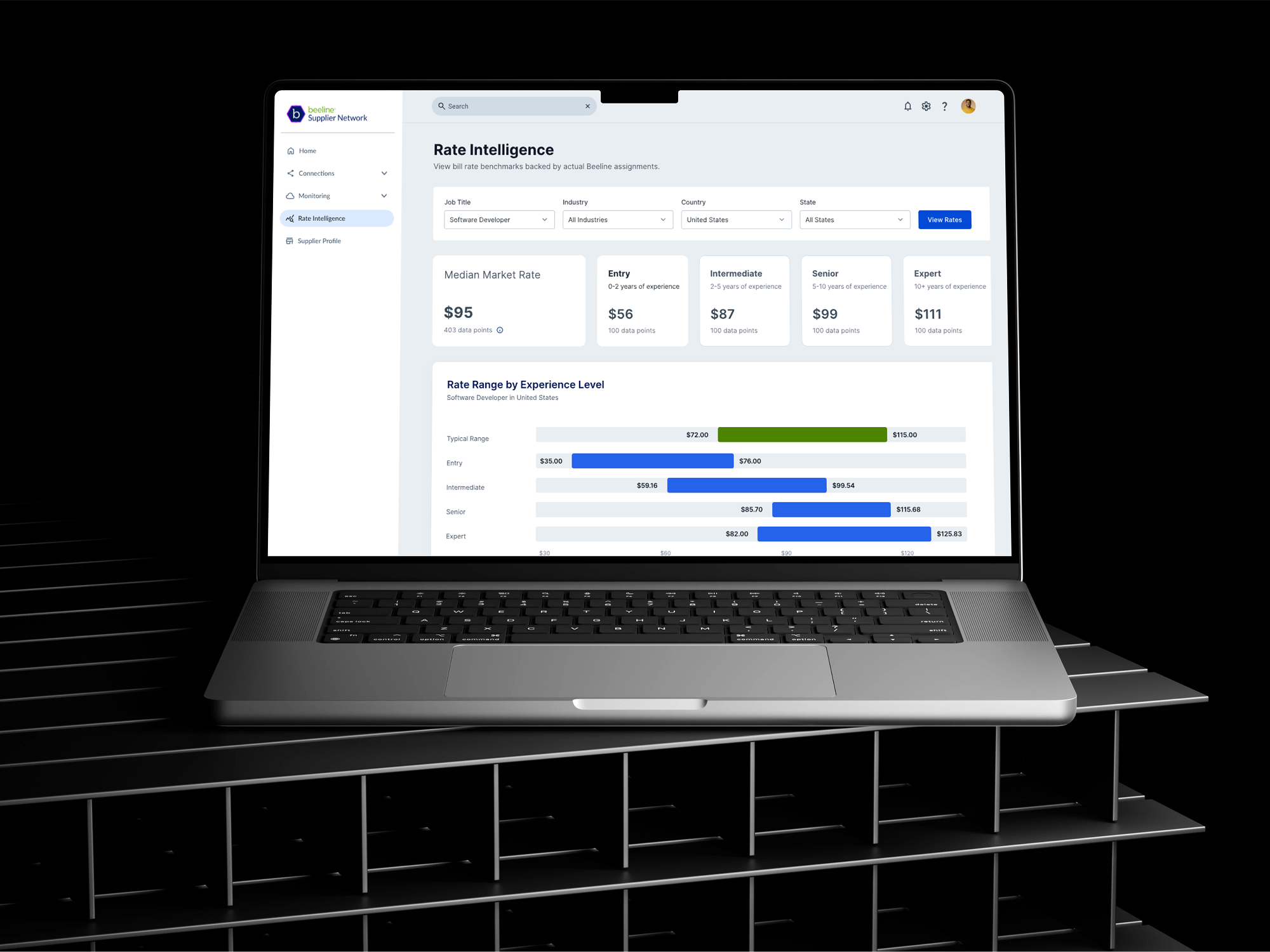
Beeline Rate Intelligence
Role
Product Designer
Duration
Oct 2025 - January 2026
Results
96%
Retention among existing clients
41%
Increased in demo bookings in the first two weeks post-launch
4
Close new client sales
1,500+
Daily users
Context
Staffing suppliers must balance competitiveness and profitability when pricing submissions, but lack access to reliable market benchmarks. Despite this, most suppliers lack access to reliable, real-time market benchmarks, forcing them to rely on instinct rather than insight. This resulted in inconsistent pricing strategies, low confidence, and inefficient negotiation cycles.
Problem
Staffing suppliers operate in a high-stakes pricing environment with limited visibility into rates.
No reliable market rate data, leading to guesswork
Misalignment between job requirements and rate budgets
Limited transparency into what customers consider “fair market rates”
RESEARCH & DISCOVERYGetting Insight
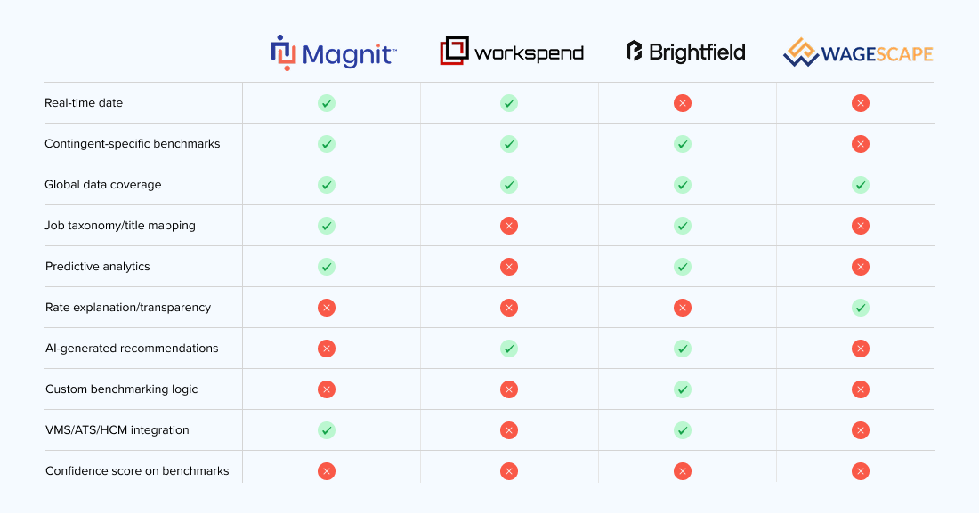
Before any screens got built, we needed to know what "trustworthy" actually meant to the people using this tool. I framed a short survey with my PM, targeted at recruiters and hiring managers, and ran it against affinity mapping of prior research to pressure-test our assumptions. I also ran a competitor analysis to see how other market-rate tools presented benchmark data and where they fell short.
81% of respondents said they needed answers fast, no scanning, no digging through pages of data. That meant the win condition wasn't "show more data," it was "show the right signal in the fewest seconds possible." I used that finding to push back on an early instinct toward a denser, more analytical dashboard, and made speed-to-answer the design constraint everything else had to serve.
Key Design Decisions
Instead of handing users a wall of numbers, I designed around one clear signal: is this rate below, on par with, or above market? Recruiters could glance at a requisition and instantly know where they stood. I considered showing raw averages or a list of closest matches, but both invited false precision — numbers that looked exact but weren't reliable given our data constraints. The categorical signal, paired with a clear explanation, kept things honest.
Because we were working with a limited dataset, we built in guardrails. When a benchmark didn't have enough data points behind it, the UI said so — nudging users to treat it as directional, not gospel. It felt counterintuitive to design a tool that sometimes says "IDK," but protecting trust in the data mattered.
I started with the Power BI blue print, then expanded the view after leadership feedback — adding level-range bar charts under the median-rate KPIs so users could compare distributions and trends across role, geography, and time.
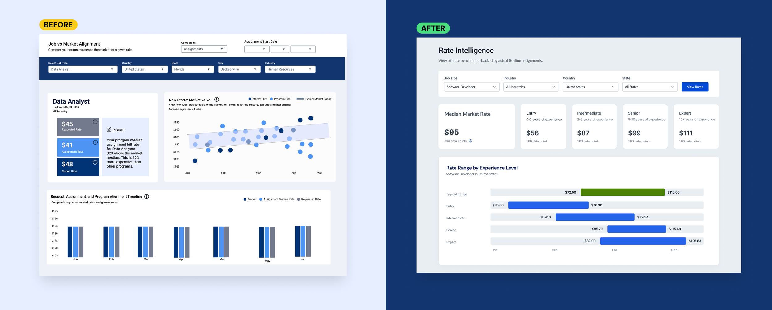
The first pass was done by our data team in Power BI. I raised concern early about embedding a separate application into the product wasn't a wise product decision on its own, let alone one that pulled recruiters out of their flow to a disconnected tool. It's a strong tool for internal analysts, but it didn't match how our recruiter persona actually works, and taking users out of the product into Power BI felt clunky and interrupted their flow I didn't want to ship a dashboard that looked authoritative but felt foreign to the people using it, and worried it could shape how clients perceived the brand. I was given the green flag to create a custom interface for the tool.
When stakeholders asked to validate the concept on real data rather than placeholder values, I was able to use a .json file in Figma Make to import a live dataset into so leadership could click through something true to life, fast. When a planned Figma-MCP integration didn't get approved.
REFLECTIONSLooking Back
Getting leadership sign-off was the real bottleneck on this project, not the design work itself, so part of my job was building the case, not just the interface: framing the survey data and prototype clearly enough that approval was a fast "yes" rather than a drawn-out negotiation.
Working alongside our data scientist also sharpened how I think about ownership. She translated raw numbers into reasoning; I translated that reasoning into something people could act on without misreading it. That overlap taught me that whoever touches this data, on either side of the interface, needs full context, or numbers could be misread.
If I could rewind, I'd push for a clickable prototype early enough to A/B test the motion and layout calls I had to lock in to hit the release date.