Beeline Supplier Network 2.0: Homepage Redesign.
Problem
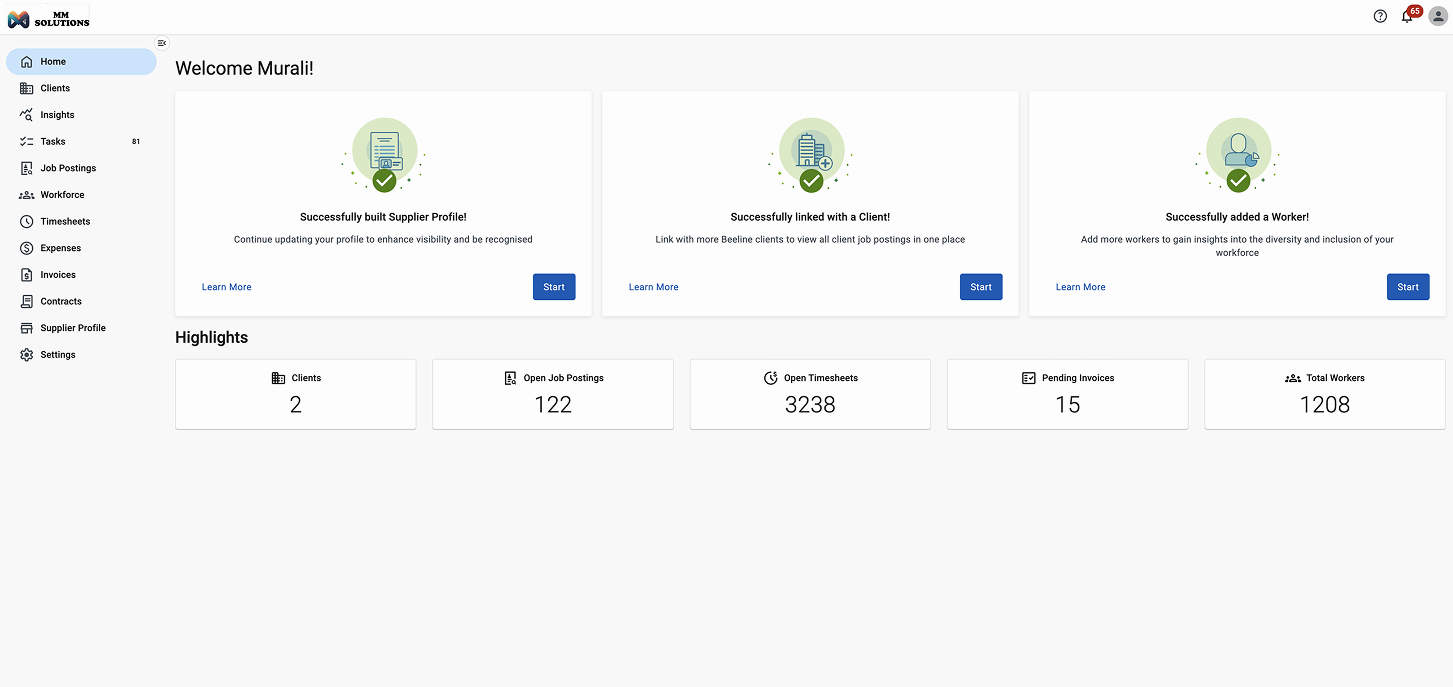
Suppliers logging into Beeline Supplier Network landed on a clean but contextless dashboard. There was no sense of progress, no guidance on what needed attention, and no clear view into usage, integrations, or performance — the things suppliers most needed to gauge how they were doing on the platform.
The page also treated every supplier the same, regardless of whether they were brand new or a long-time user, offering no way to see what mattered most for where they were in their journey.
Solution
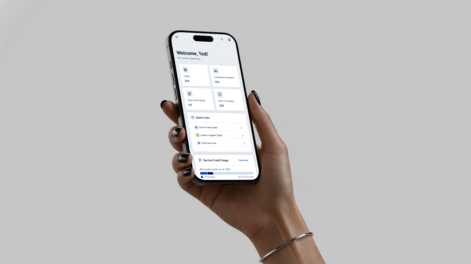
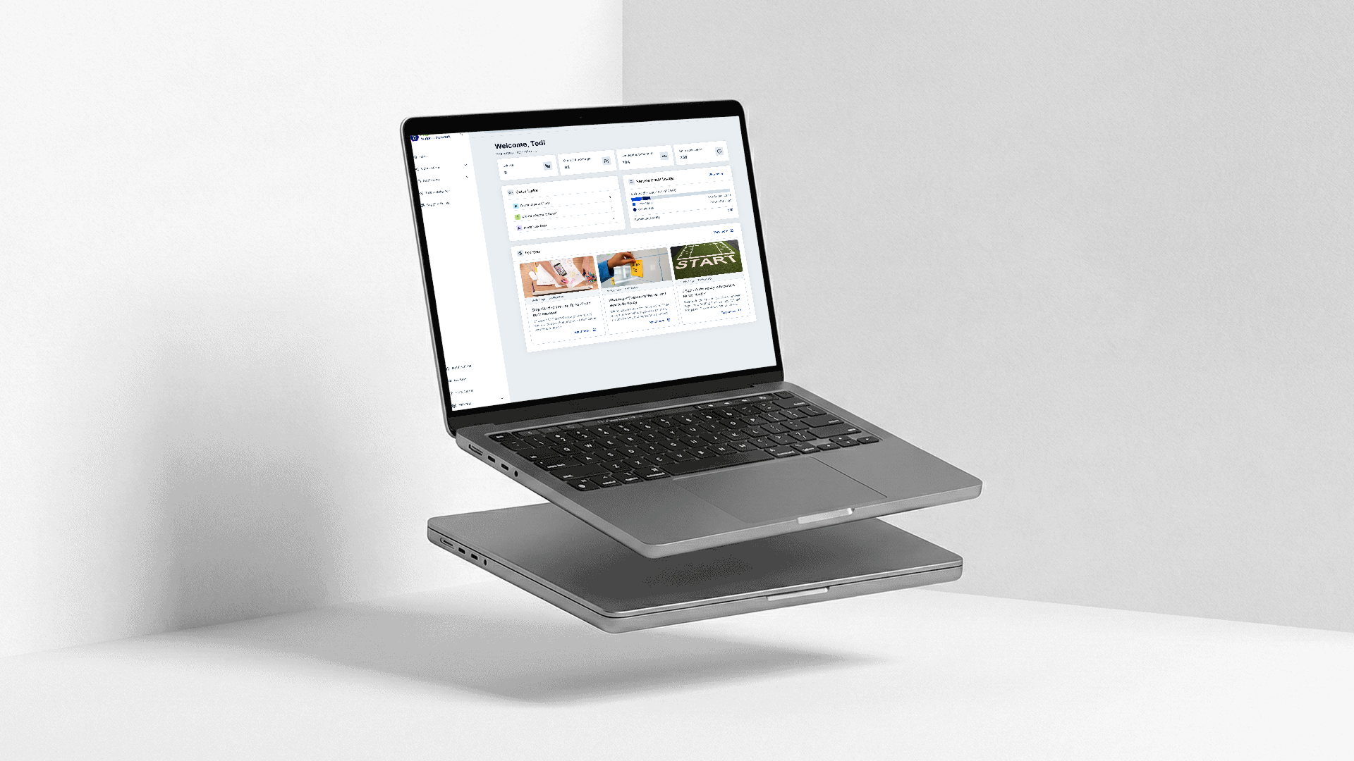
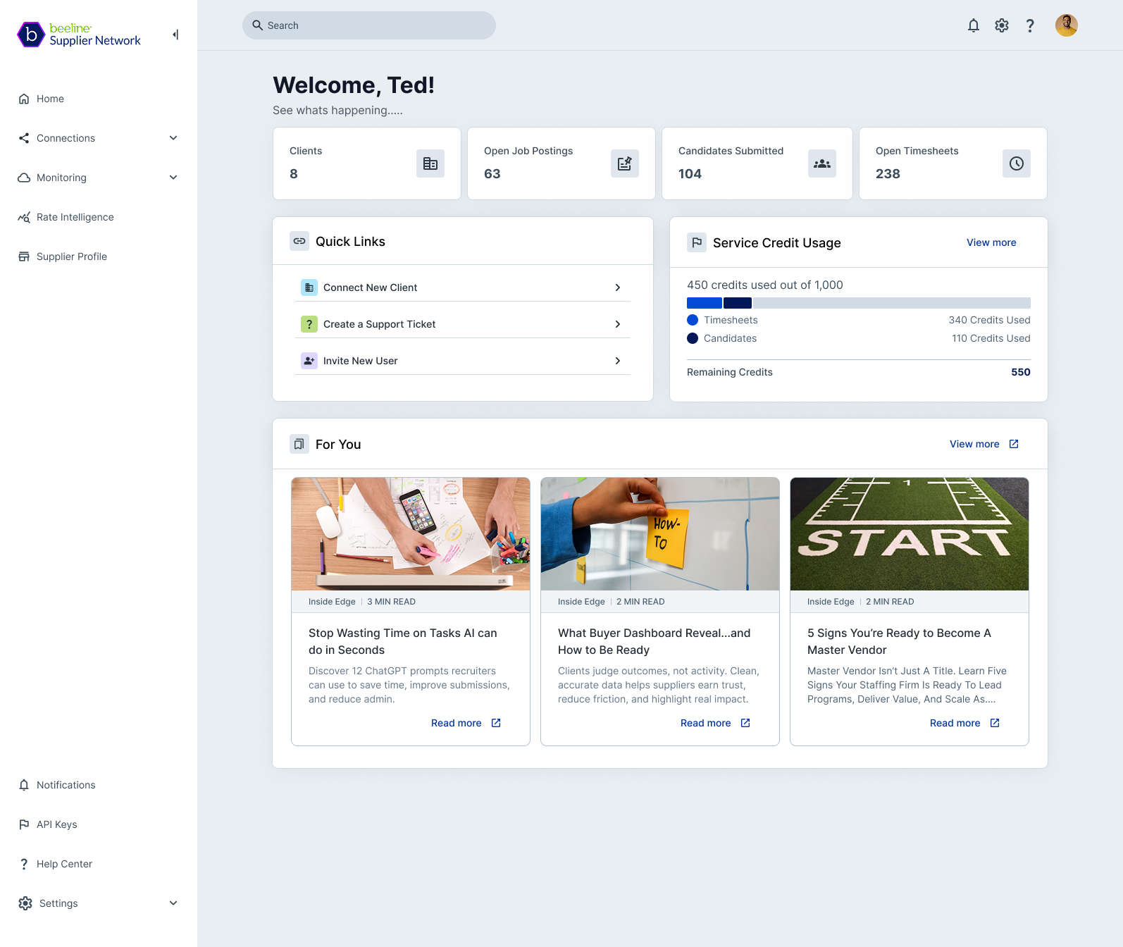
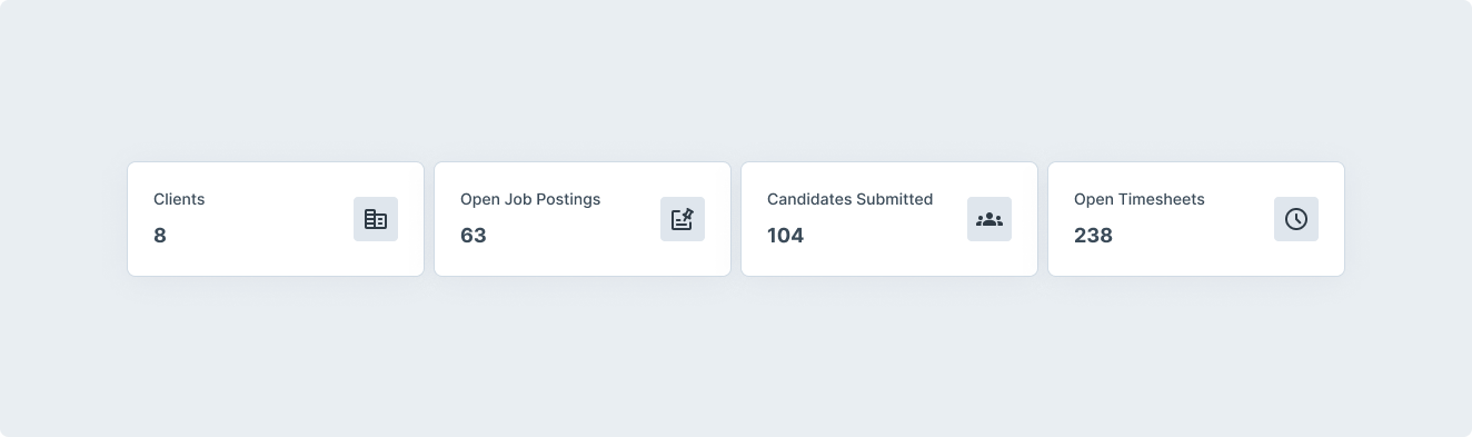
I owned the entire post-login experience end-to-end — home page, onboarding, navigation, and settings — and redesigned it around one goal: give suppliers transparency into their usage, integrations, and performance from the moment they log in.1.0 "fast facts" carried forward for MVP (Clients, Open Job Postings, Candidates Submitted, Open Timesheets), giving suppliers an immediate pulse check on activity.
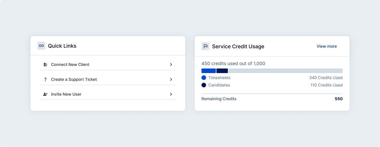
A lightweight usage widget showing service credit consumption at a glance, with a link out to the full usage page for suppliers who want more detail.
Quick links to the three highest-frequency actions: creating a support ticket, connecting a new client, and inviting a new user — removing the need to dig through navigation for common tasks.
Notifications and alerts, scoped to what suppliers actually need to act on — client connection status, credit usage thresholds, renewal timing, and outage/maintenance notices — separated from lower-priority marketing and event content.
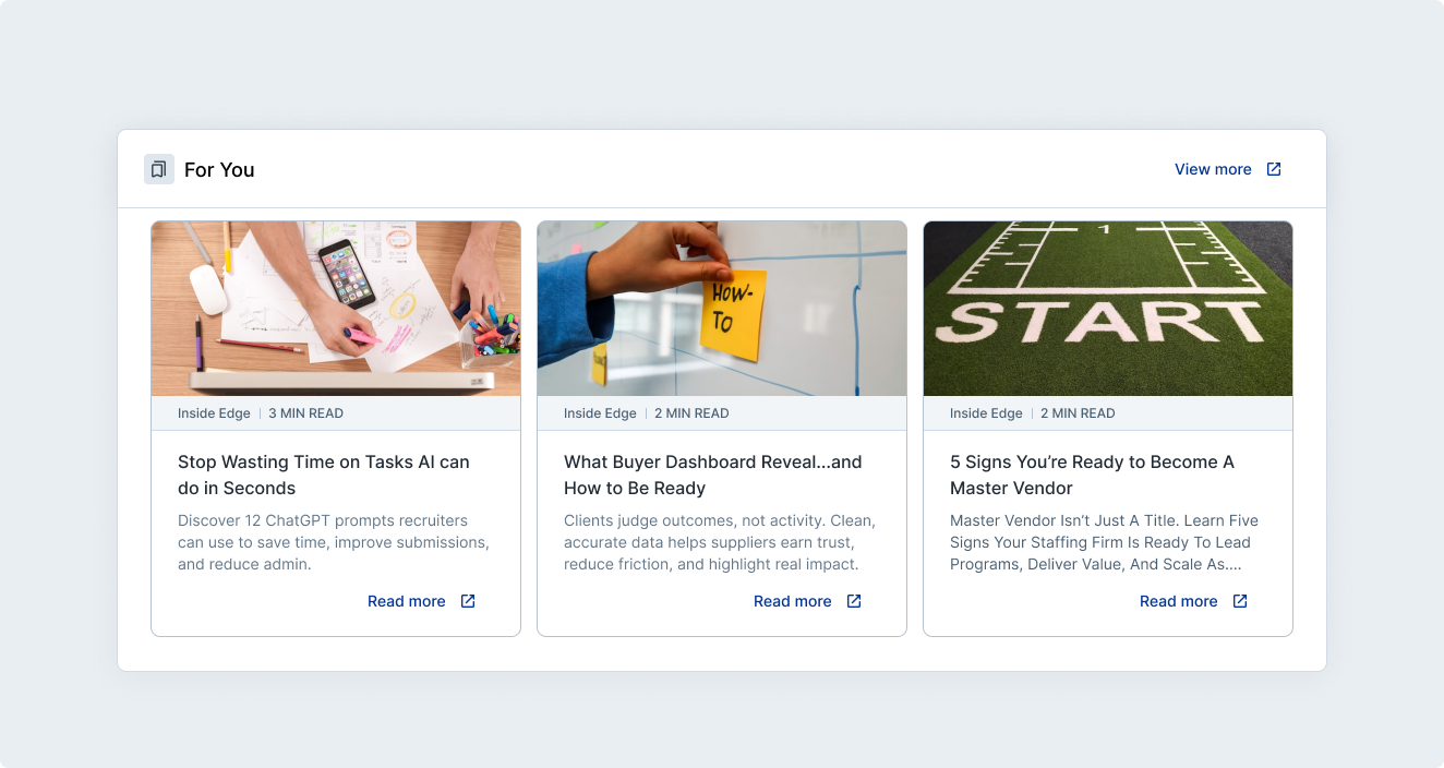
Marketing blog tiles linking out to Inside Edge content, kept lightweight so they support rather than compete with the functional widgets above.
Process
I started by auditing the 1.0 home page against what suppliers actually needed to know day to day, then story-mapped the fuller feature set with product to sequence what belonged in MVP versus a later phase — for example, bulk user invites and marketing messaging were flagged for v2 so the initial release could stay focused on the highest-value transparency features first.
The project wasn't without setbacks. Architecture hadn't locked critical decisions in time, and that ambiguity ended up scoping the home page down to just fast facts and blog tiles, cutting the usage widget, quick links, and notifications from the release. I pushed back and negotiated to get those elements restored, walking through the fact that most of those page elements were already built out elsewhere in the product, so including them wouldn't add the level of extra work architecture was assuming. That reframing got buy-in for the fuller scope.
Before
After
Takeaway
The redesigned home page replaced a static, one-size-fits-all dashboard with a page that gives every supplier a persistent, at-a-glance view of usage, integrations, and performance the moment they log in — directly addressing the platform's goal of increasing supplier transparency.