Project Performance
Giving Suppliers Answer, Not Dashboards
Turning a data dense dashboard into a clear answer
Role
Product Designer
Timeline
2 Months
Tools
Figma, Claude
Context
Beeline is a vendor management system companies use to manage their contingent workforce, including the staffing suppliers who fill open roles. Supplier Network 2.0 is the portal those suppliers work in daily: receiving requisitions, submitting candidates, tracking fills.
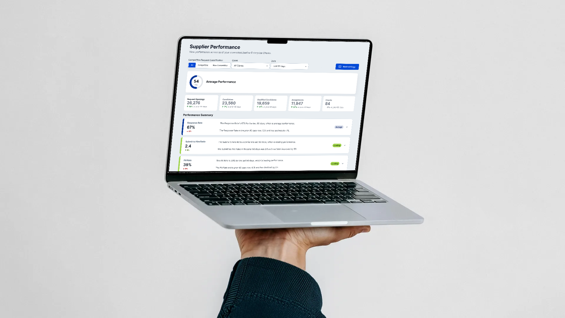
Project Performance is the feature in Supplier Network 2.0 that shows suppliers how well they're actually performing against the metrics clients judge them by.
The Problem
An earlier version of the dashboard was built by the data team. It was overwhelming and answered the question an analyst anticipated, not the ones brief wanted answered.
The Goal
Enable suppliers to answer their primary performance questions within 30 seconds of landing on the page.
DISCOVERYWhat the Audit Found
The dashboard was organized around the database schema, not the supplier's head. Getting an answer to something as basic as "how am I doing" would have meant filtering, cross-referencing charts, and doing the analysis themselves, before it ever reached the people who'd have to use it that way.
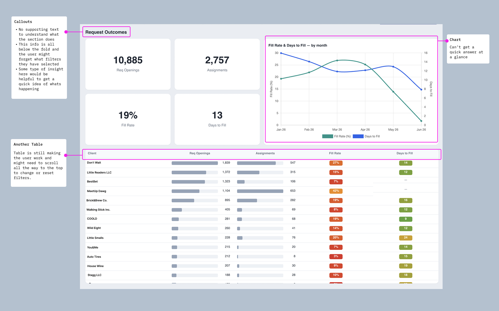
No supporting text anywhere explaining what a section showed or how trustworthy the numbers were: "Where is the trust?"
A root-cause summary table placed above the top-line KPIs: "Why would I start looking at the root cause before I even know if I have a problem?"
A heavy, ungrouped filter bar: "So many filters! Does the user really need to see all the filters at once?"
Inconsistent filter placement: "Should the date filter be in the same line as the rest?"
Charts with no built-in takeaway: "Can't get a quick answer at a glance."
Key summary numbers (Request Outcomes) pushed below the fold, easy to miss entirely
RESEACH
Four real reasons suppliers opened this dashboard.
Before touching the layout, I mapped why suppliers actually came looking for performance data every scenario turned out to be a request for a decision, not an analysis.
01
Internal business reviews
Supplier operations teams run their own business reviews and need to understand performance without waiting for a client to provide a report.
How are we performing?
02
Deciding where to focus
Where are we underperforming?
Performance can vary significantly across clients, industries, or areas of the business.
Where do we outperform expectations/market?
03
Contract renewal preparation
Suppliers need evidence when demonstrating their value during contract conversations.
04
Onboarding new recruiters
What does good look like?
New team members need context for what good performance looks like.
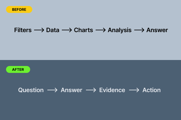
InsightNone of these are exploratory data-analysis tasks—they’re essentially “Tell me something I can act on,” which became the central design principle for Project Performance: instead of asking users to interpret a dashboard, the interface should do more of the interpretation for them.
From Dashboard to Decision Tool
This shift changed how I approached everything from information architecture to metric selection to data visualization. The goal wasn't to hide complexity. It was to introduce complexity only when the user needed it.
Defining the Metrics
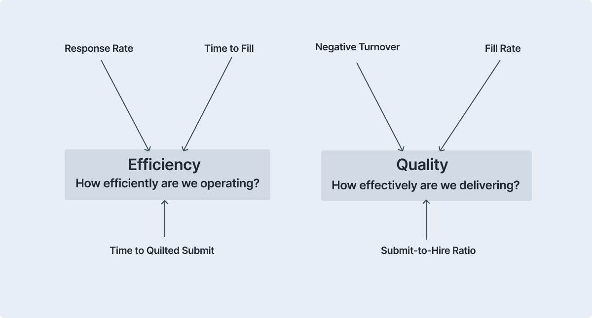
Working closely with the Data Science team, I anchored the experience around six performance metrics.
Rather than presenting every available data point, the metrics were organized around two concepts suppliers already understood:
Designing for Trust
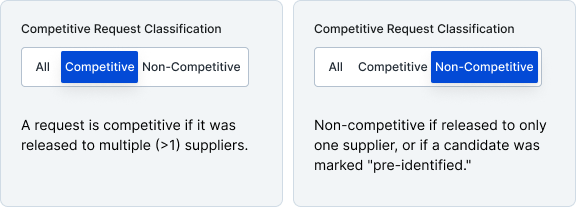
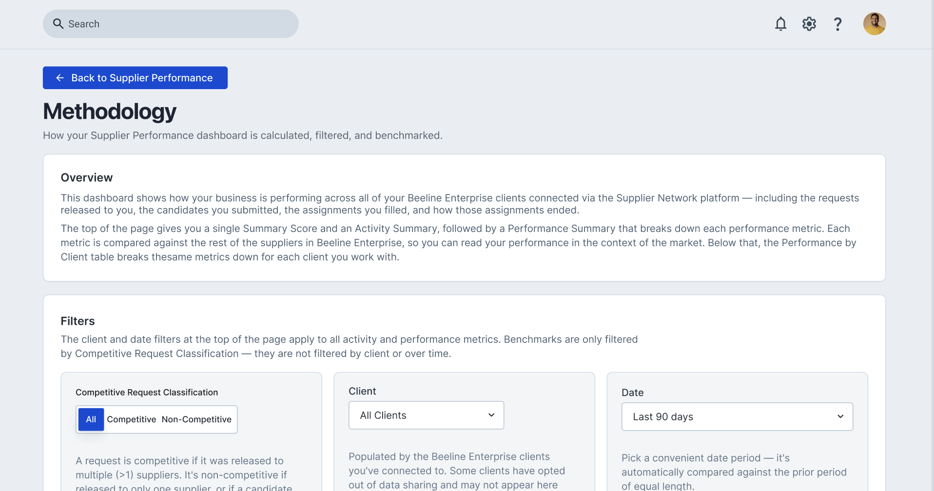
When suppliers see a benchmark, they need to understand exactly what population and criteria produced that number.
One early decision was to explicitly distinguish competitive vs. non-competitive requisitions within the experience rather than assuming users already understood the difference.
That distinction mattered because a benchmark without context can look authoritative while being difficult to interpret.
A metric is only trustworthy when users understand what is actually being measured.
This became an important partnership between Product Design and Data Science: making sure the interface didn't simply display metrics, but provided enough context for users to interpret them correctly.
Information Architecture
Once the metrics and use cases were established, I structured the experience around three progressively deeper questions. Structuring it this way meant the majority of users that just need a quick answer never have to touch the dense table, while the minority doing real investigation aren't stuck with a shallow summary.
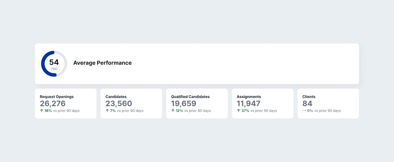
01 - OrientationWhat’s been happening?
The first layer gives suppliers a quick understanding of their business volume. The KPI cards aren’t intended to require any interpretation.
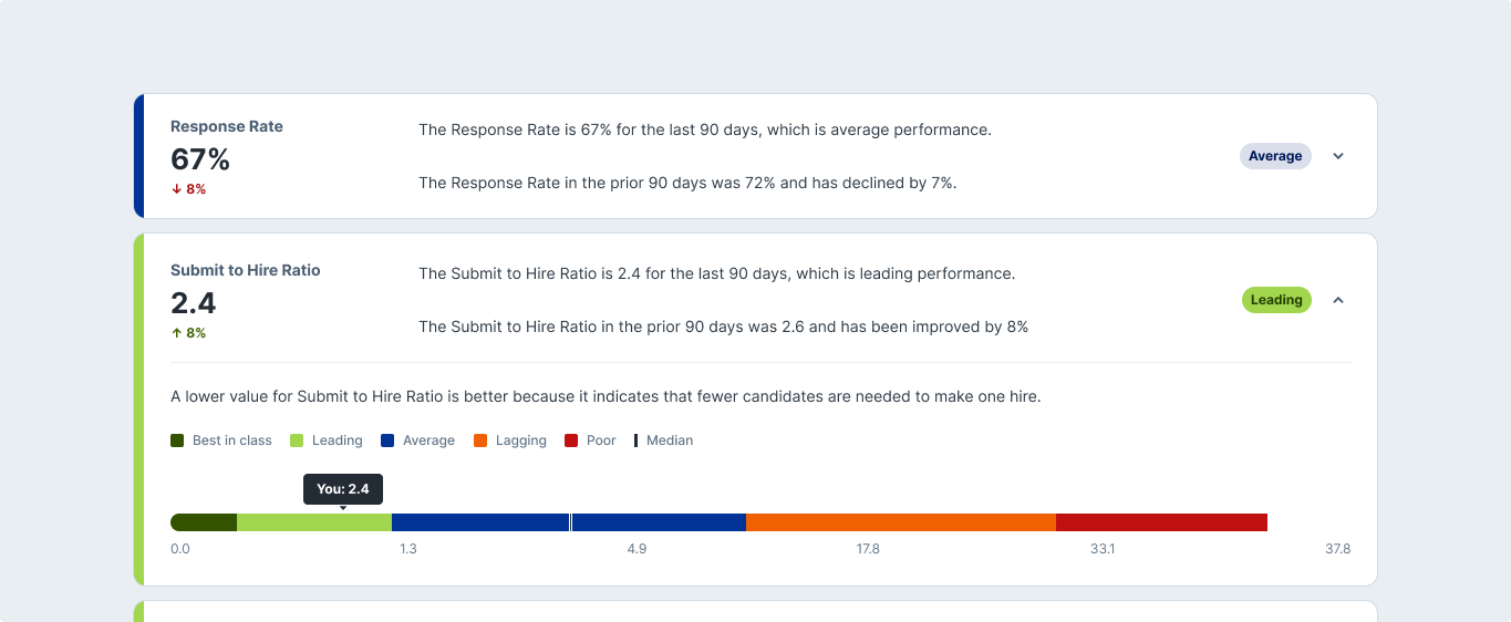
02 - EvalutationHow am I doing?
The second layer answers the question suppliers actually came to the page to answer of how they are performing. Instead of forcing users to find relationships between separate charts, the interface creates those relationships for them.
Why?
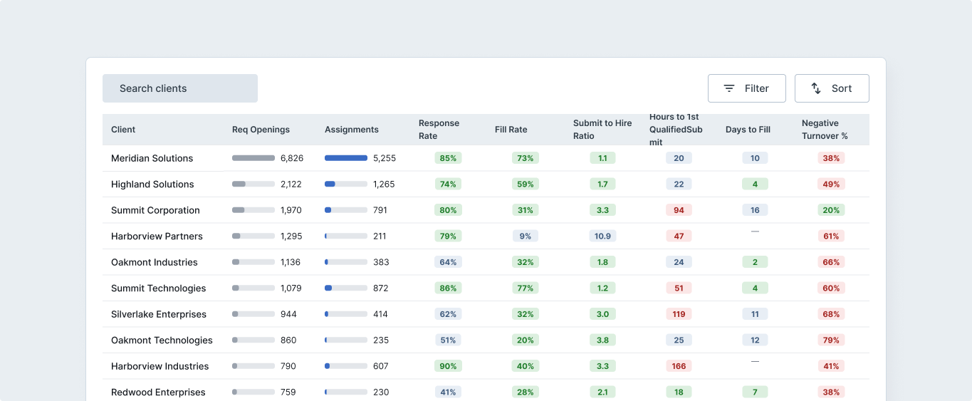
03 - InvestigationThe final layer provides a more detailed data table for users conducting an investigation to better understand the above layers and need to go deeper. This is where the experience becomes intentionally more dense.
One of the challenges was balancing users who want a quick answer with users who need to investigate the data. A traditional dashboard often solves this by giving everyone everything. That creates cognitive overload. Instead, I used progressive disclosure.
Designing for Two Types of Users
This allowed one experience to support both behaviors without making either user navigate unnecessary complexity.
Are we doing okay?
Why did this happen?
What I learned
More data doesn’t create more clarity
The problem wasn't that suppliers lacked information. They lacked a clear path through it.
Metrics need context to earn trust.
A number without a definition, comparison, or population can create more questions than answers.
Progressive disclosure can make complex products feel simple.
The solution wasn't removing complexity. It was deciding when users actually needed it.
Good enterprise UX moves the cognitive work into the product
The best dashboard isn't the one with the most information. It's the one that helps someone answer an important question with the least unnecessary effort.
TakeawayThe fix was a visual polish and shifting the cognitive work from the supplier to the interface. Giving suppliers a direct answer instead of dense data.
Keep Reading