Crafting Beeline’s Data Visualization Style Guide & Theme
A data visualization style guide and theme that brings consistency and accessibility across data products in the Beeline ecosystem.
Overview
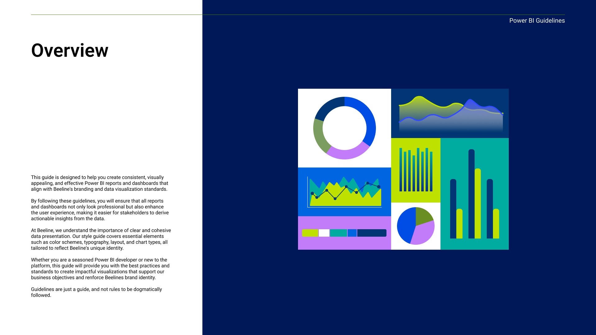
Power BI dashboards and data products at Beeline had no shared design system, leaving every dashboard visually disconnected from the brand and from each other. As the solo designer on this initiative, I partnered with the data science team to build a theming system that gave dashboards a consistent, accessible look, without limiting the exploratory work data scientists needed to do.
Problem
The design system had no templates, theme presets, or documentation for data visualization. This caused inconsistency across data products, diluting brand identity, raising cognitive load and friction for users, and forcing the data team to make design decisions on every project.
Goal
Build consistent dashboards that strengthen brand credibility, improve user experience to create familiarity for the users, and eliminate the weekly design-review cycle with data science.
Research & Discovery
I spent the first three weeks understanding the actual scope of the inconsistency and what issues they created for stakeholders and users alike.
AUDIT
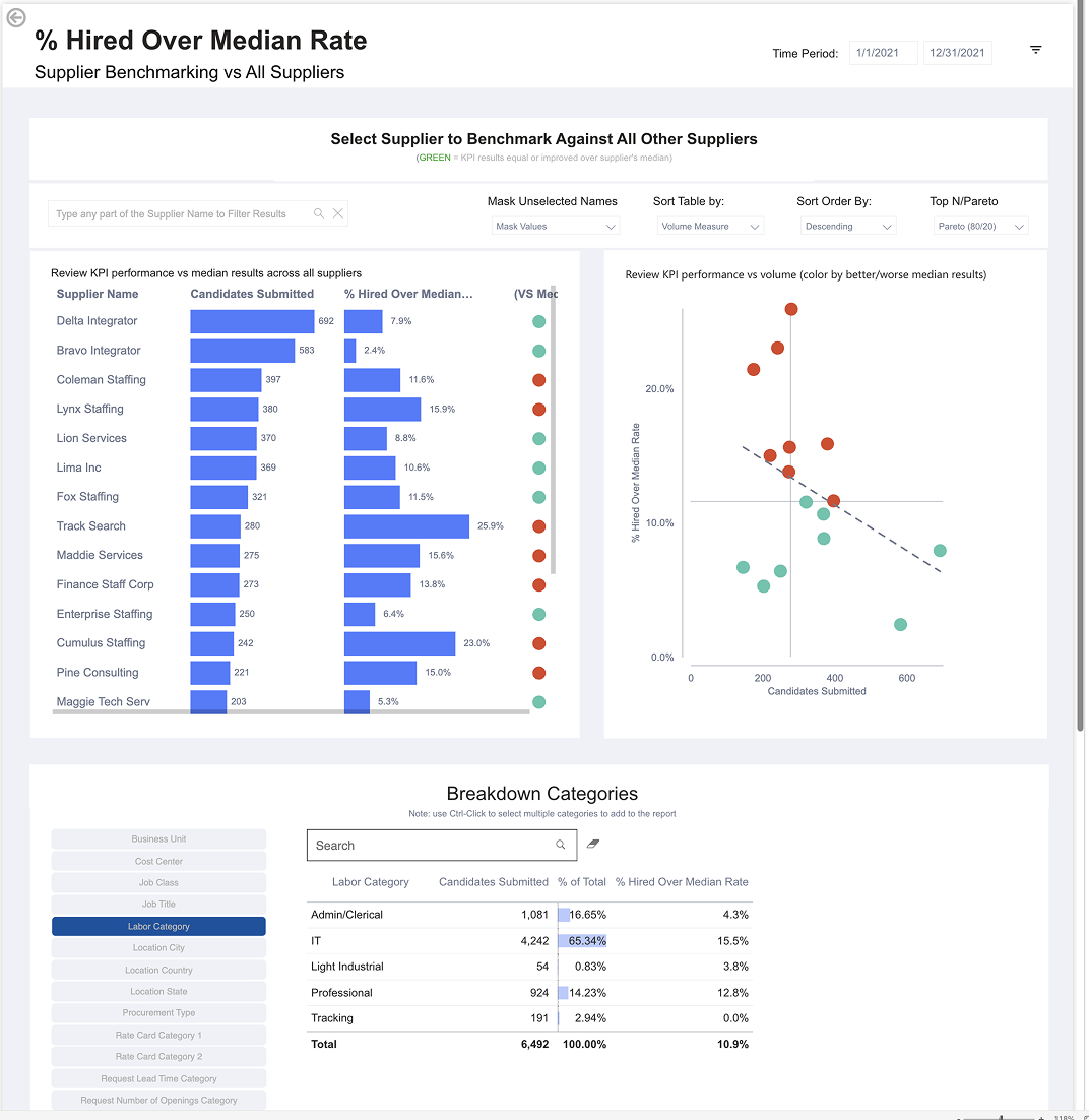
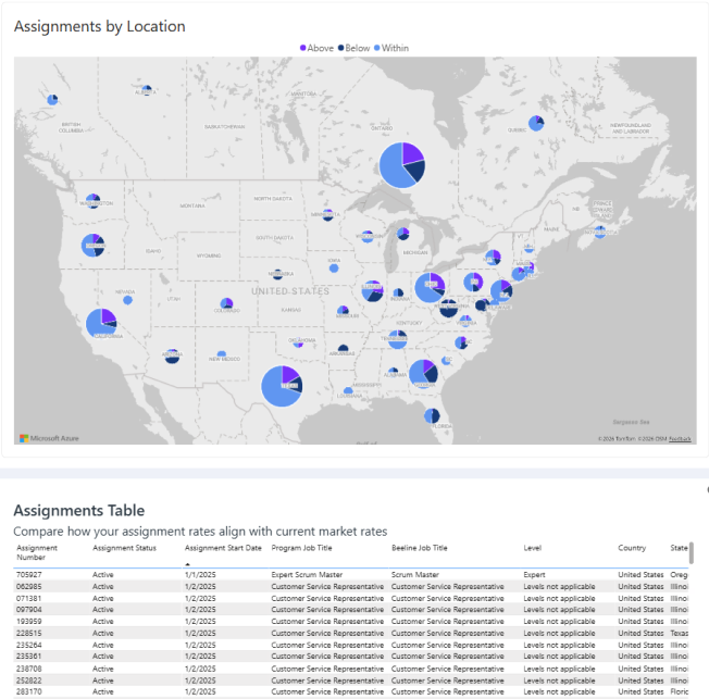
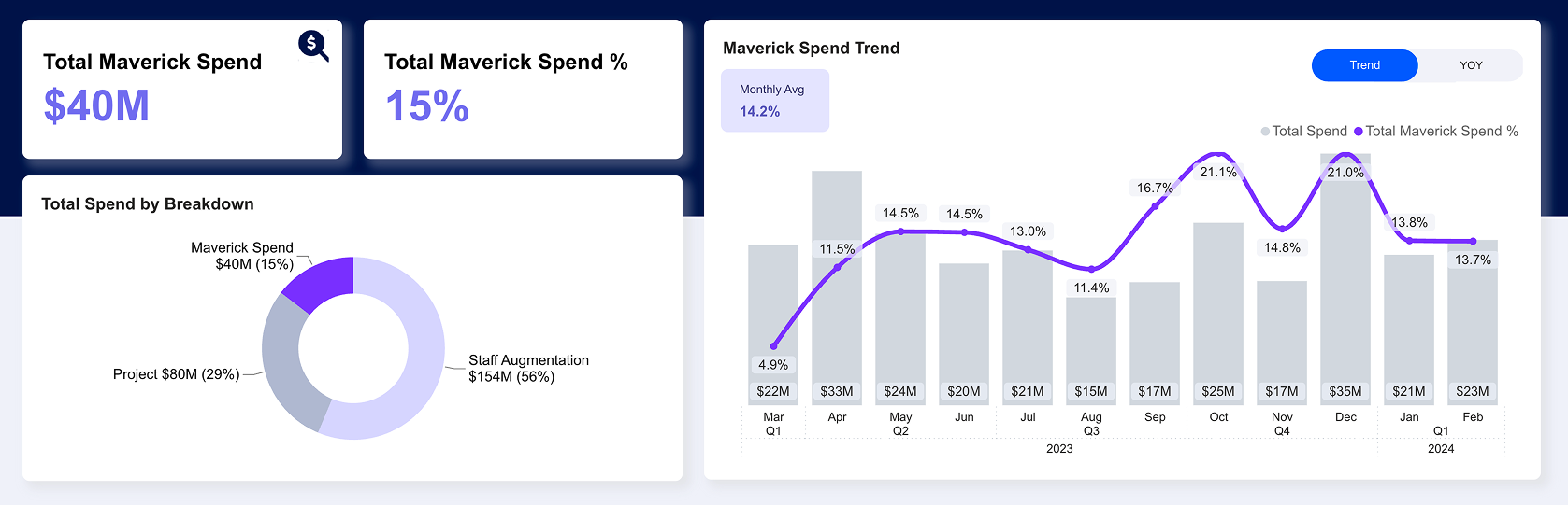
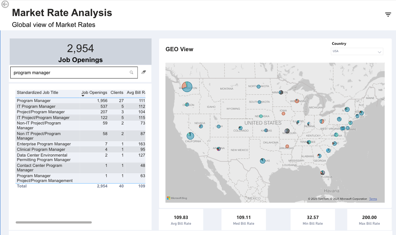
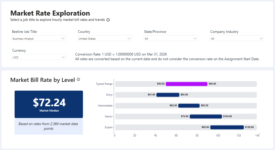
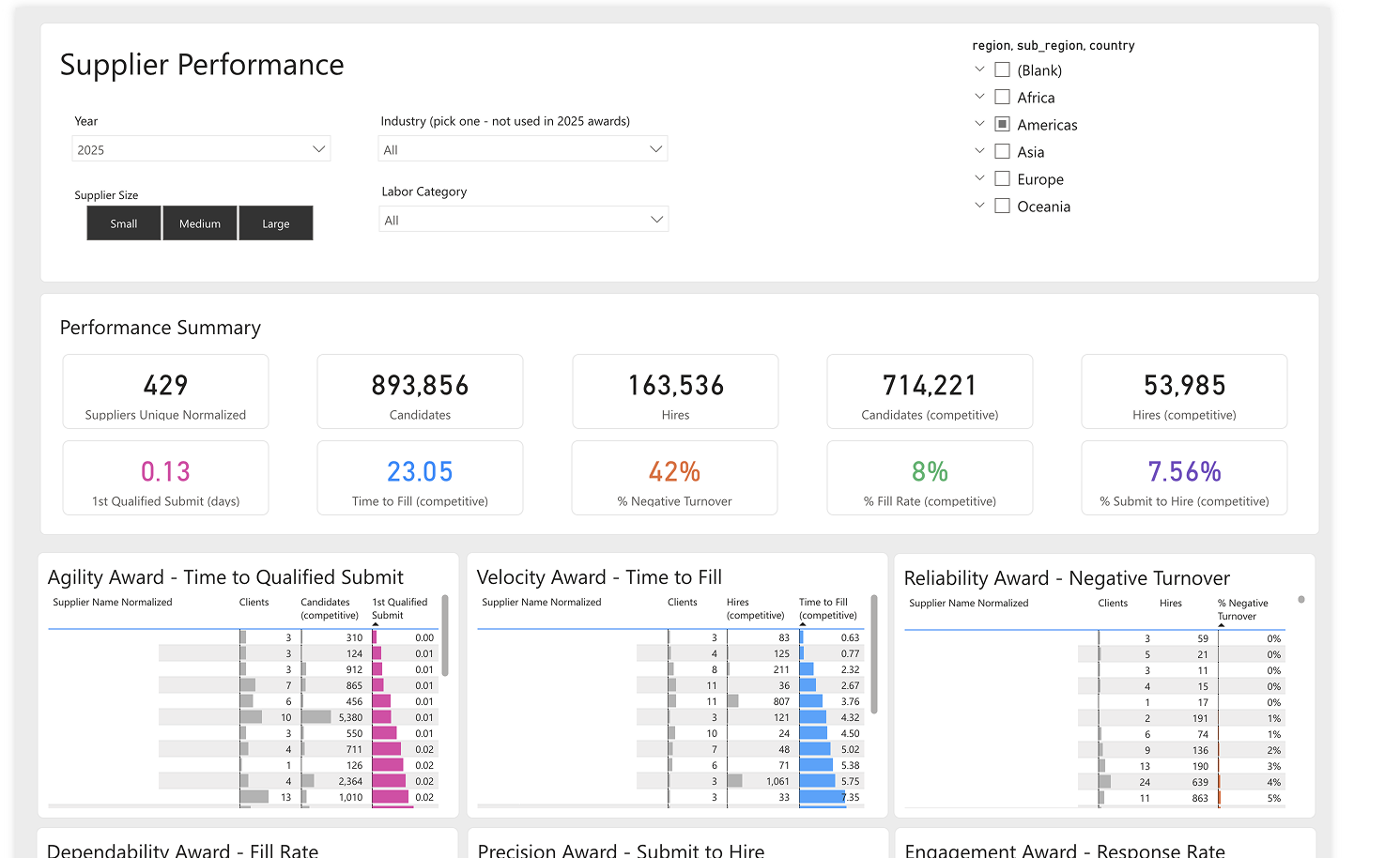
I reviewed the entire sales demo sight that had twenty two dashboard and found major inconsistency that boiled down to page layout, inconsistent colors, and lack of supporting text for charts.
INTERVIEW
Interviewing the data team was eye opening on how limited Power BI as a tool can be for them. I was also able to surface what was actually blocking consistency, and why the team would push back on design.
RESEARCH
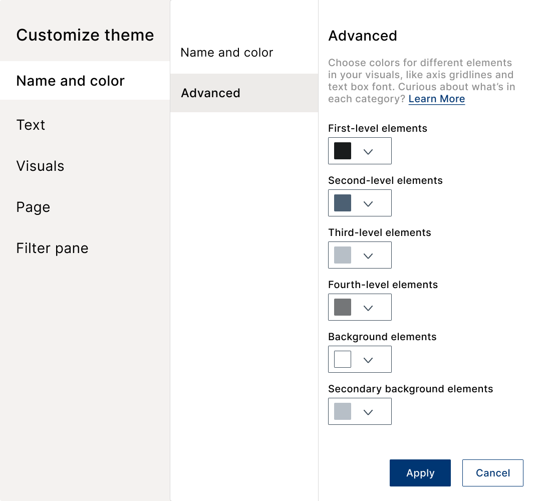
To my surprise I had a hard time finding data visualization style guides. So I dug into the Power BI documentation site and found out about base themes, and theme JSON files and how our team could use them to solve the consistency problem.
SOLUTION
A theme, not a template
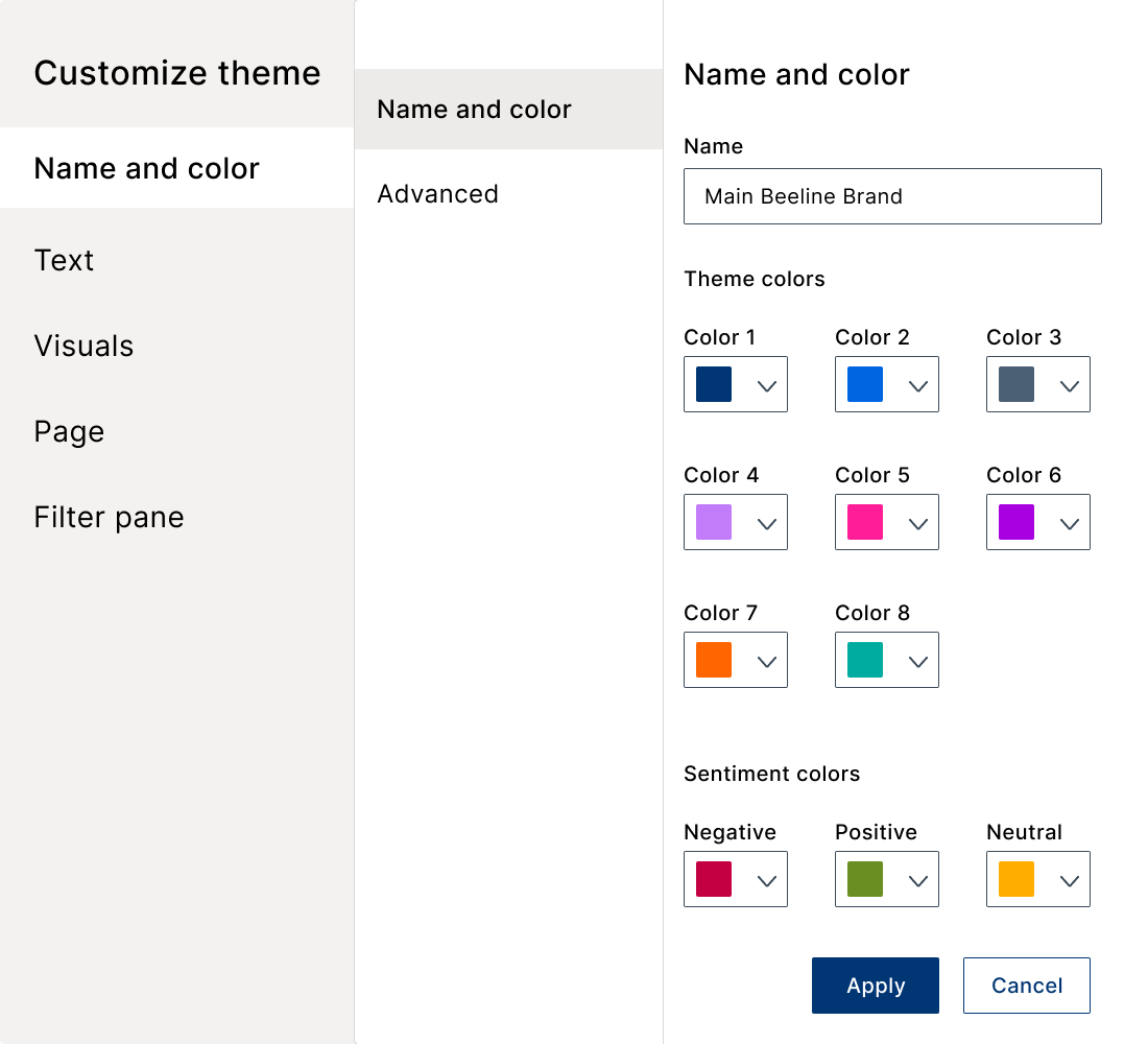
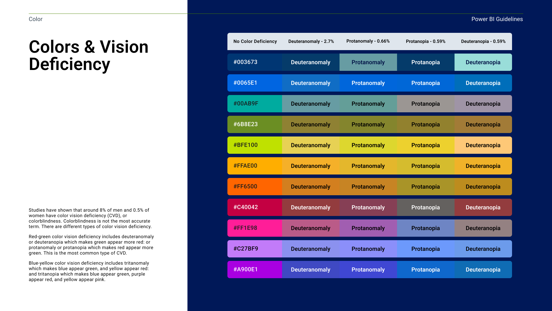
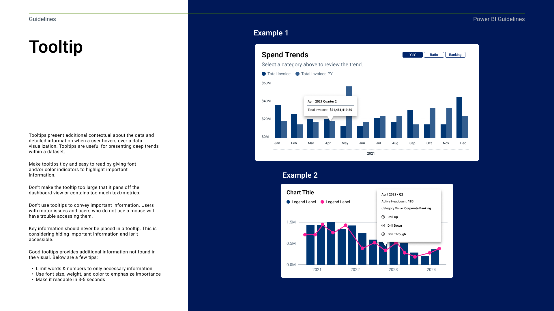
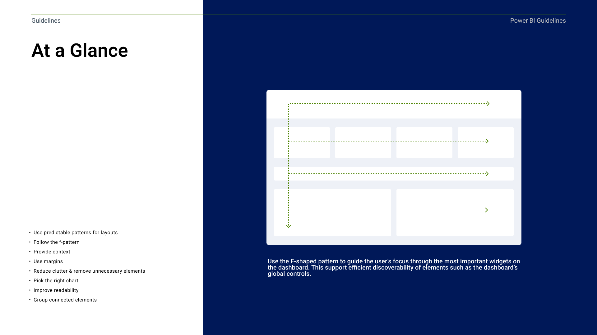
Power BI theme files (.json) for reports, dashboards, and presentations, paired with a best practice guide covering color, typography, iconography, page layout, and accessibility.
Applying the theme file to a dashboard was a quick win for update everything at once to create cohesive interfaces across products. The guide behind it explains the reasoning behind design decisions and gave explains if any edge cases came up.
The system worked at the theme level instead of the layout level, data scientists kept full control over what they built. Dashboards just came out on-brand by default — no more asking which blue to use or where filters belonged.
WHAT I GOT WRONG AT FIRST
My initial assumption was that a brand guidelines document and a page in the design system would be enough. Researching into how Power BI actually applies styling led me to use theme files and style presets, along with giving them a style guide that could be used for edge cases and onboarding new team members.
RESULTS & IMPACT
What Changed
Cut the design handoff between data science and development by 97%, eliminating the weekly sync and returning an hour a week to the team
Reduced development time by a full sprint due to the team not having to map out new colors or other elements.
Removed manual design decisions — color choice, filter placement — from the workflow, freeing data scientists and developers to focus on the analysis, not the styling
Reflections
Power BI has real limits on visual customization without a dedicated development team, and Beeline's BI developers had limited experience with advanced custom layouts and charts. I trying to create a dashboard in Power BI helped me better understand pain points the data team had shared. The tool’s own limits shaped what was realistic, and understanding those limited firsthand changed how I approached the fix.