Rate Intelligence
Designing for confident, data-informed pricing for staffing suppliers
Context
Staffing suppliers must balance competitiveness and profitability when pricing submissions, but lack access to reliable market benchmarks. Despite this, most suppliers lack access to reliable, real-time market benchmarks, forcing them to rely on instinct rather than insight. This resulted in inconsistent pricing strategies, low confidence, and inefficient negotiation cycles.
Goal
Design a solution that enables suppliers to:
Price competitively without sacrificing margin
Align with customer expectations
Make faster, more confident decisions
Problem
Staffing suppliers operate in a high-stakes pricing environment with limited visibility into rates.
No reliable market rate data, leading to guesswork
Misalignment between job requirements and rate budgets
Limited transparency into what customers consider “fair market rates”
RESEARCH & DISCOVERY
Getting Insight
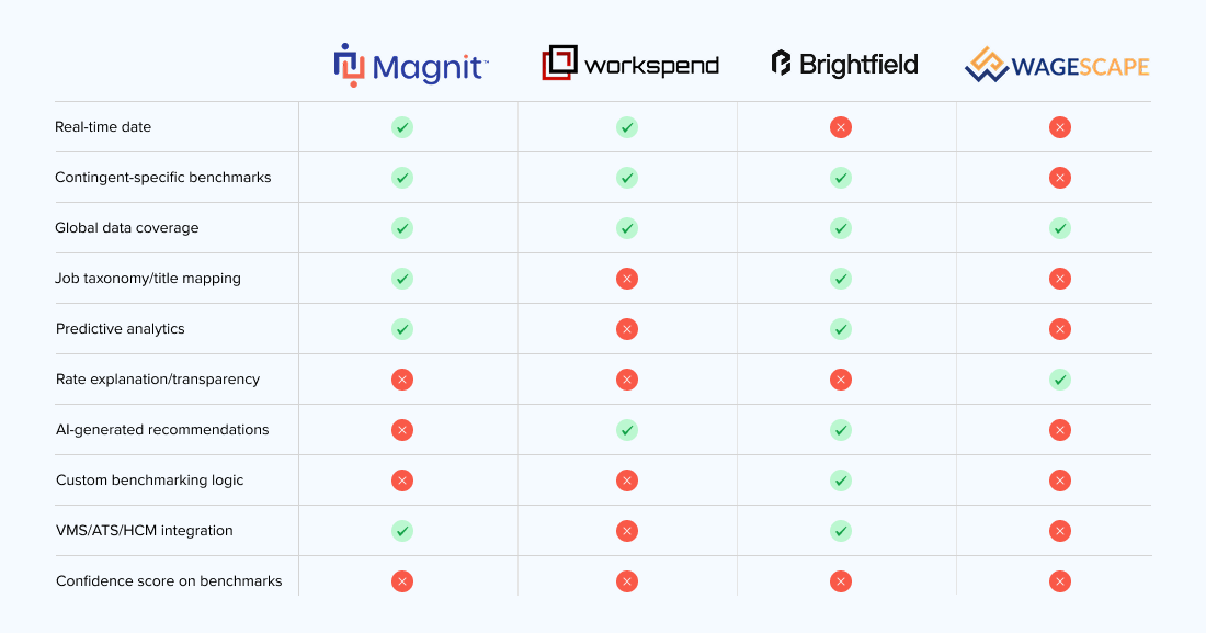
Before any screens got built, we needed to know what "trustworthy" actually meant to the people using this tool. I framed a short survey with my PM, targeted at recruiters and hiring managers, and ran it against affinity mapping of prior research to pressure-test our assumptions. I also ran a competitor analysis to see how other market-rate tools presented benchmark data and where they fell short.
The result reset the brief: 81% of respondents said they needed answers fast, no scanning, no digging through pages of data. That meant the win condition wasn't "show more data," it was "show the right signal in the fewest seconds possible." I used that finding to push back on an early instinct toward a denser, more analytical dashboard, and made speed-to-answer the design constraint everything else had to serve.
Solution
Instead of handing users a wall of numbers, I designed around one clear signal: is this rate below, on par with, or above market? Recruiters could glance at a requisition and instantly know where they stood.
I considered showing raw averages or a list of closest matches, but both invited false precision — numbers that looked exact but weren't reliable given our data constraints. The categorical signal, paired with a clear explanation, kept things honest.
Because we were working with a limited dataset, we built in guardrails: when a benchmark didn't have enough data points behind it, the UI said so — nudging users to treat it as directional, not gospel. It felt counterintuitive to design a tool that sometimes says "IDK," but protecting trust in the data mattered.
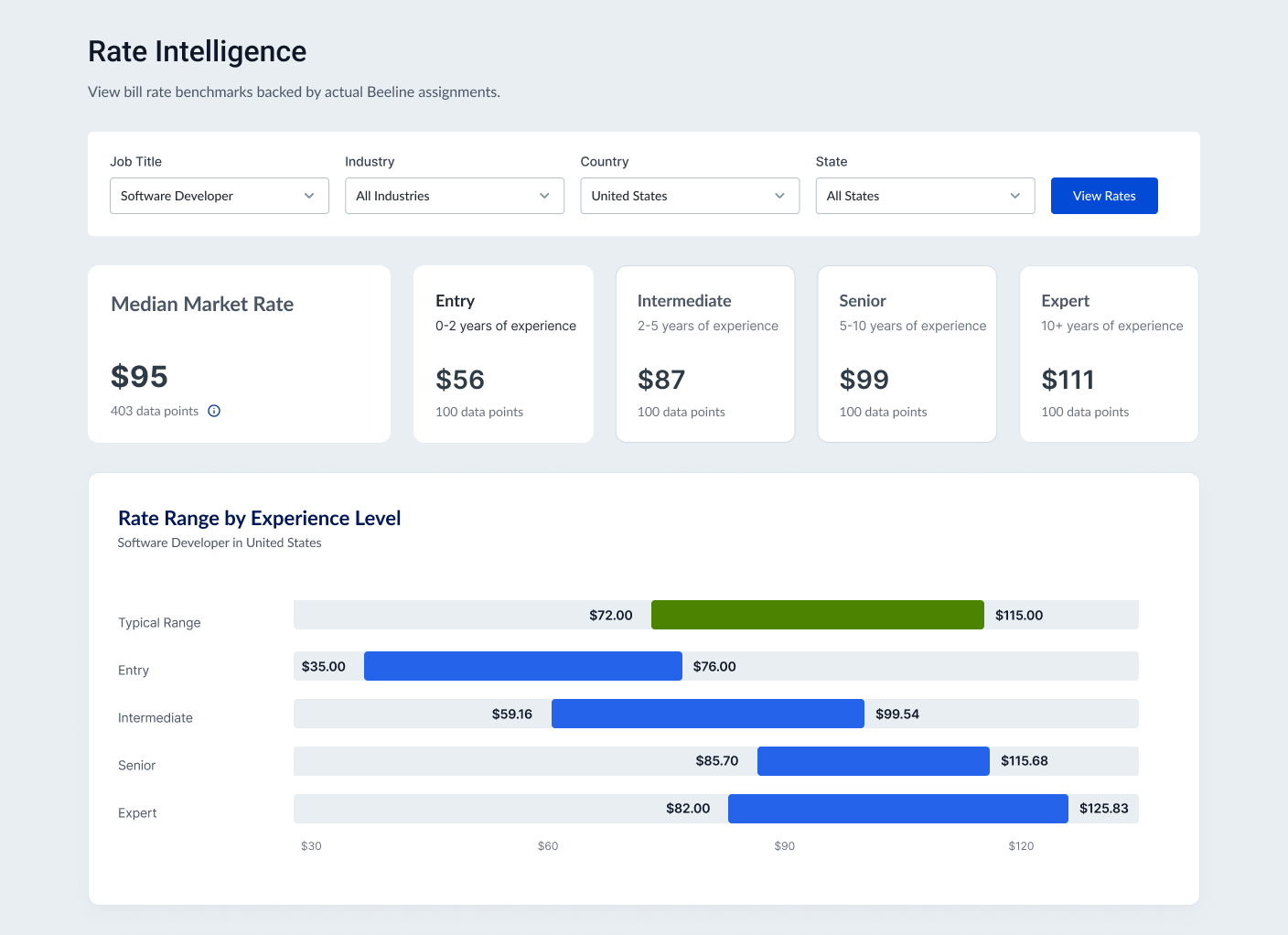
I started with the Power BI blue print, then expanded the view after leadership feedback — adding level-range bar charts under the median-rate KPIs so users could compare distributions and trends across role, geography, and time.